
Isn't this owl beautiful! The die set and background paper are from Honey Bee Stamps, the sentiment from Stampin' Up. Link up your cards for Dad and special guys in the SAS4Kids challenge blog.
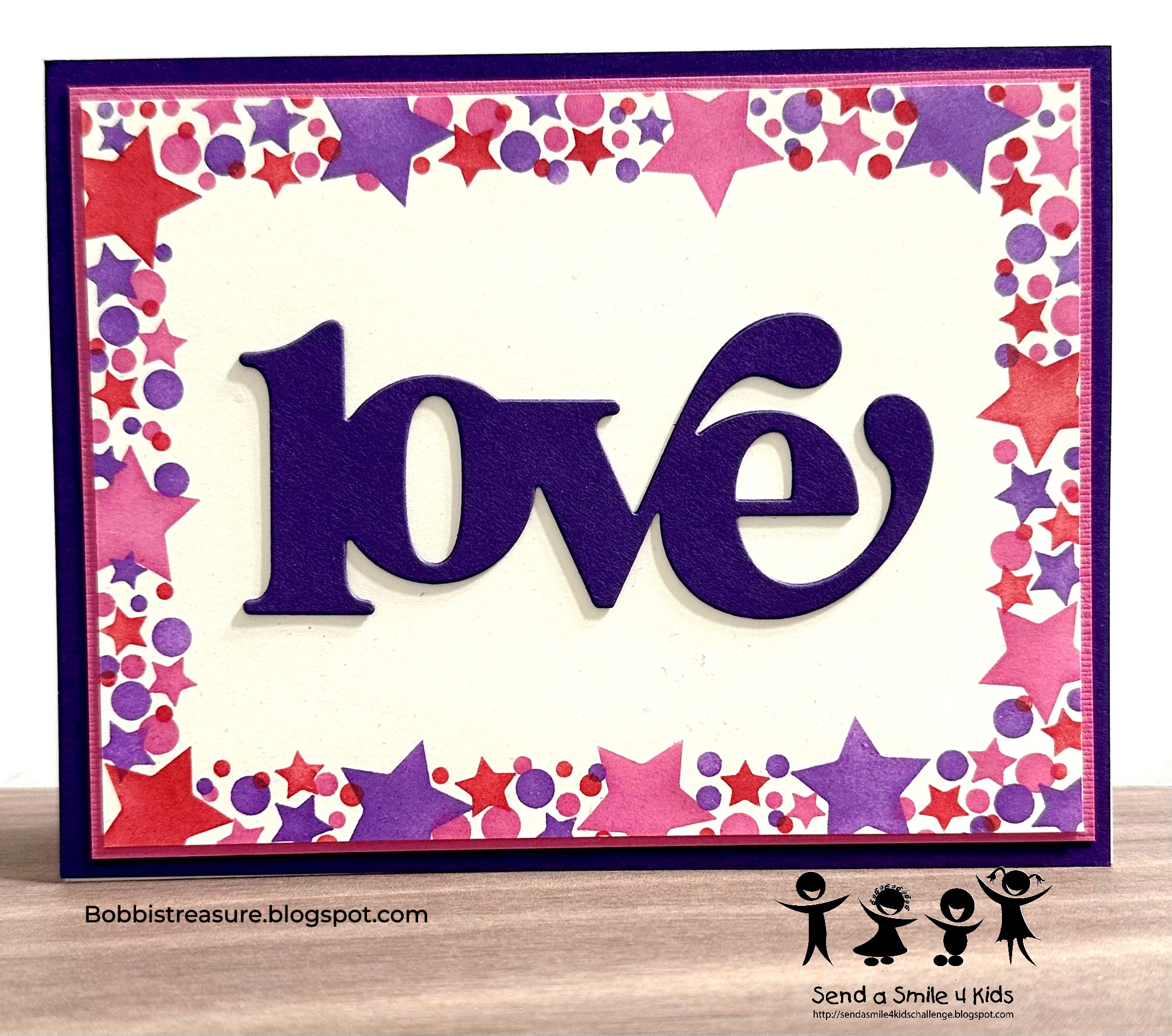
Happy April! I am so looking forward to Spring! With the new month there is a new challenge from SAS 4 Kids - For the Ladies. They are looking for Cards 4 Moms/Special Ladies (from the kids). Here is mine:

Happy March! It’s time for a new challenge from SAS4K. This month, we encourage everyone to make a card for a boy of any age. Here’s my contribution:

A little texture and some bright colors. Hurry summer!!! Be sure to link up your creation to the Send A Smile 4 Kids challenge blog!
The Color Throw Down had a blue, green, and kraft challenge. Here is my version:

The ink blended oval is Concord and 9th inks Blueberry and Parsley. Gina K Silhouette, SU sentiment. I recently won a Concord and 9th drawing and am loving their inks I chose!!!! I layered kraft behind the cream layer to soften the transition to the black layer. Here is the inspiration image:
Be sure to check out the current Send A Smile 4 Kids Spring/Easter challenge!
It’s the first Saturday of the month and that means it’s time for the Send A Smile 4 Kids challenge. This month we are looking to see Spring or Easter themed cards in our gallery.

This is made from a Paper Pumpkin kit. I think that I get so caught up in techniques, that I lose sight of how easy and pretty kit cards are to make. So give yourself some grace, and know that not every cards needs 20 die cuts or 10 layers. Simple is great too!! Show off your Spring or Easter card, no matter how simple or fancy it might be at Send A Smile 4 Kids!


